Route lines overlay AIS targets making them hard to see, especially at smaller scales (zoomed out).
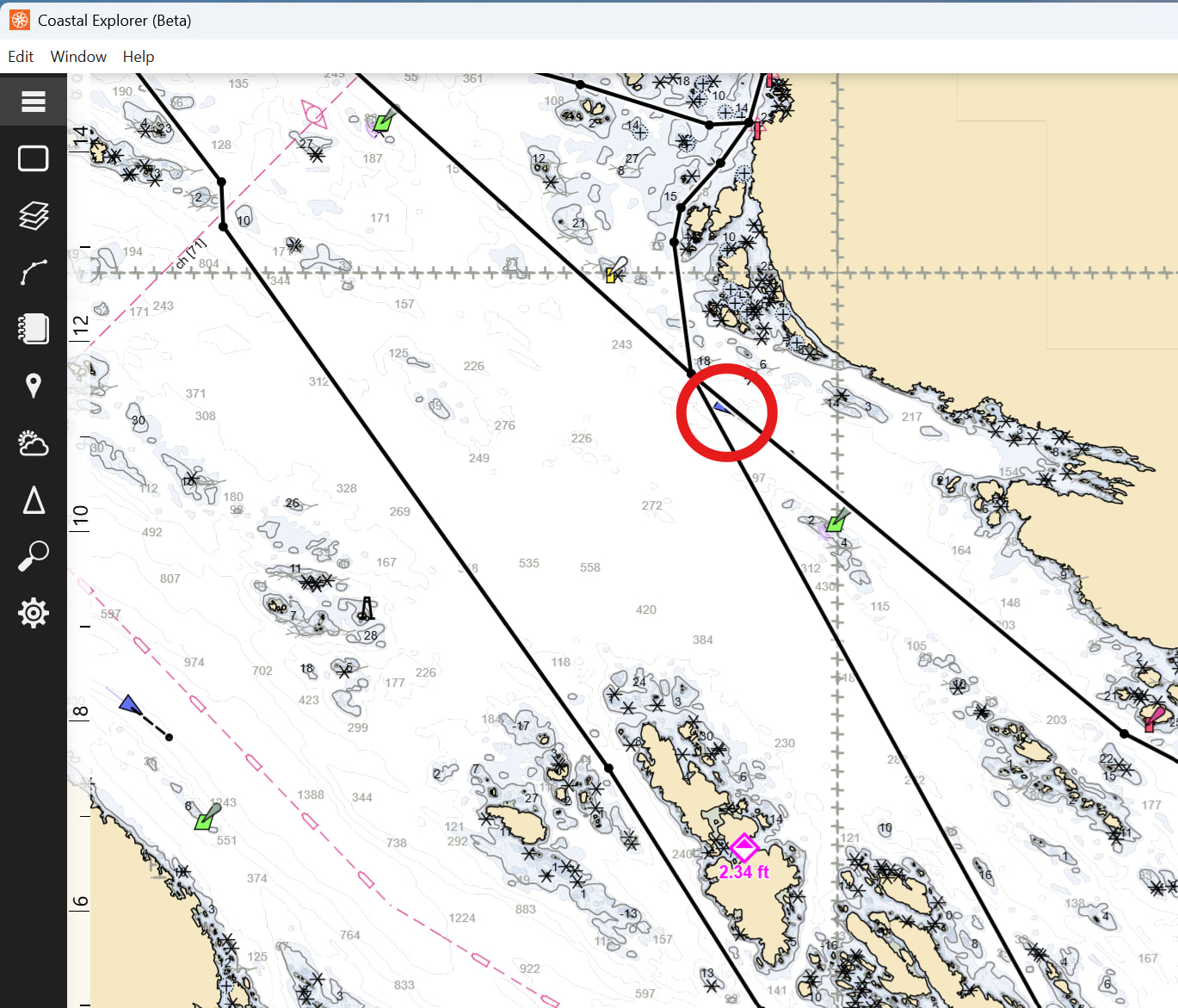
On a related note, when no route is selected, all routes are displayed using the same heavy black line as in the above screen shot. Once a route is selected, all the other routes are deemphasized and are displayed using a thin line and lighter gray color. Having lots of routes in an area gets pretty noisy with the current display convention, and I would like to suggest the default display of non-selected routes be more similar to the light gray thinner lines used for non-selected routes when a route is selected. And perhaps use a color other than gray/black for the routes to make them less easily confused with the depth contour linework on the vector charts?