Important Update - 5/23/2024:
NOAA’s progress towards ending raster chart production is nearing completion. As I’m writing this, there are only 228 (there used to be well over 1000) raster charts still being produced, and there are fewer almost every week. For the purposes of safe navigation in US waters, I recommend relying on vector charts regardless of your preference.
4/25/2023:
In the list of Cons for raster charts below, I mention that the raster charts are slowly being phased out. This is now well underway, with less than half the original raster catalog still being available and updated. I suggest that anyone relying on raster charts switch to vector, since those are now the most complete chart catalogs for US and BC waters.
We are frequently asked which type of chart (raster or vector) is best. There isn’t a single right answer to this question. While both types of charts are designed to give you all the information you need for safe navigation, there are reasons why some navigators prefer one over the other.
Let’s discuss their pros and cons.
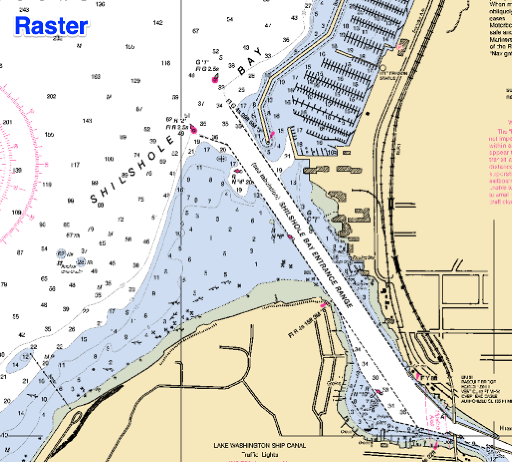
Raster Navigation Charts (RNC, or BSB)
Raster charts are the closest thing to paper charts because they are simply a scan, or photograph, of a paper chart. They’ve also been in use longer than ENC (Vector Charts), since scanning a paper chart is much easier than the processes used in the production of vector charts.
Pros
-
Raster charts have the familiar appearance of a paper chart. Being more familiar in appearance can give some people, especially those who have been using paper charts for many years, a sense of familiarity or comfort.
-
They often have more detail on shore. They will sometimes have topographical contour lines, and other land-features that are often lacking in vector charts.
-
Some parts of the world may have better raster coverage than vector since it takes time to perfect the process and do the conversion. British Columbia, for example, does presently have better raster coverage for some remote areas. This is changing, however. It took NOAA many years to bring their vector portfolio to the same level as raster.
Cons
-
Text on the chart, including depth values, will change size depending on which chart you’re currently viewing and your viewing scale. This isn’t such a big problem when over-zoomed, since these text features will still be legible due to being larger, but under-zooming will make the text smaller. Small features like depth values can be much harder to read. This is usually remedied by zooming in a bit more, either making text larger or switching to a chart that’s more appropriate for that viewing scale, or zoom level.
-
Charts may also be displayed at an awkward rotation, making text appear upside-down, or drawn sideways. Most raster charts have a north-up orientation. This is fine if your chart display is also set to north-up, but if you are in heading-up mode and you aren’t navigating due north, the text on raster charts will be turned accordingly, making it more difficult to read the text, just like rotating a paper chart on your chart table would.
-
Since the features on a raster chart are nothing more than pixels of various shades and colors, you cannot obtain information about features that are not printed on the chart itself.
-
Raster Navigation charts are slowly being phased out. NOAA and CHS are both moving to eliminate raster charts from their portfolios over the next few years.
-
Although we do change the appearance of raster charts when in dusk and night modes, it is not as effective as what can be done with vector charts.
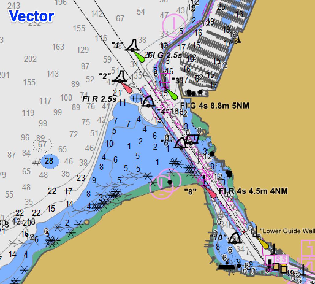
Vector Navigation Charts (ENC, or S-57/S-63)
Rather than being a scan of a paper chart, features in vector charts are defined in a much more flexible way, as geometric primitives like polygons and points. Although it is not necessary for the user to know this, it explains why they have the capabilities they do, as explained further below.
Pros
-
Being composed of geometric primitives, software developers have a considerable amount of control over both the appearance of the chart and what information is shown. There are standards for what symbols and colors should be used for things like buoys, but there is still a great deal of control over what colors are used, what measurement units are used for depths, even whether certain features are shown at all. Our navigation software, Coastal Explorer and Rose Point ECS, have the ability to select colors for charted features, making vector charts appear much better when using features like our dusk and night modes, helping to retain night vision. Our software also gives you a great deal of control over what features are shown on the chart display, letting the user see the amount of charted detail that works for them.
-
Obstacle detection is an important safety feature enabled by vector charts. Since vector charts make it possible to know what certain features are, such as a rock or a shoreline, we can warn navigators that if they stay on the present course they may hit a rock, or run aground in a shallow area, or even run into a dock. This is simply not possible with raster charts.
-
Always clear and crisp. Things like depth values, buoy symbols, are drawn at the same size, making the chart easier to read. Other items, like shorelines, contours, etc., are always drawn at the screen’s resolution so the chart looks clear and crisp, no matter the zoom level.
-
More meta-data (data rich). Each feature on a vector chart can be queried for more information than can reasonably be displayed on the chart without cluttering it unnecessarily. This allows for deeper and more detailed information about those features to be utilized by navigation software and queried by users.
-
Vector chart formats, data, and presentation will continue to improve as hydrographic agencies continue to improve vector formats and the processes used to create them. Additionally, navigation software, such as Rose Point ECS and Coastal Explorer, will continue to benefit from the advances in vector charting.
Cons
-
Vector charts will not have the hand-drawn appearance that raster charts may have in some places. This can make them seem less artful.
-
Vector charts generally have less detail on shore. This may change over time, as hydrographic agencies work to add and improve information.
-
Although the clarity of vector charts is listed as a Pro above, it can also be a Con, since it isn’t possible to visually determine if a chart is displayed under or over its intended viewing scale. This can give a false sense of the precision or accuracy of the charted data at that scale.
Summary
While raster charts may be preferred by those who have been using paper charts for many years, due to their familiar appearance, they are being phased out by most hydrographic agencies, including NOAA and CHS. The quality of vector charts will continue to improve as the workflows and technologies used in their production improves. In a few years, vector charts will become predominant, slowly supplanting the use of raster charts.
The ability to choose whether you want to see depths in fathoms, feet, meters, etc. is a big advantage, and so is the ability to do obstacle detection, which is a major safety feature. The fine control over what colors are used allows for much better dusk and night modes.
Perhaps the biggest advantage raster charts have today, depending on where you’re navigating, is that some hydrographic agencies still don’t have a complete vector portfolio. British Columbia, for example, has better coverage in raster for some remote areas, but this will change as these agencies move toward replacing raster charts with vector charts.
For those who are navigating in the USA, I recommend trying them both. They are provided free of charge by NOAA.